Important! Please read the announcement at http://myst.dustbird.net/uru-account.htm
Also! Please read the retirement announcement at http://myst.dustbird.net/uru-retirement.htm
Simple Imager
Okay, this tutorial assumes that you know how to use Blender, make models, basic texture and UV mapping, Stenciling and Sound placement.
Making A Simple Imager
The Imager we're going to make here will display images that you put in during Age Creation, like the Imagers located in the Classroom in Bevin, and the Training Building Conference Rooms in Gahreesen.
Imagers where the player can upload images and KI notes, I'll refer to as USER Imagers and are not covered here (building them is the same, but those require something extra to upload your images to).
First you'll have to decide how you want your Imager to look. Do you want it to look something like we find in the Hoods? Like the Imager in the Guild Pubs (which are different than how I'm going to build one here, but the concept is the same), or something else?
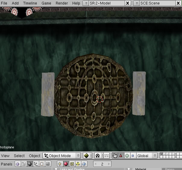
I'm partial to the ones in the Hoods, so I made a simple looking one here:
The "Guts" of the machine as you can see is the mesh with the texture with those circles in it. The one I show here is using Cyan's texture, and you may want to make you're own (I've made my own since I took this pic). I would suggest that you maintain the same sort of texture to maintain continuity as if you look, ALL of the Imagers in Uru have the same texture for their "Guts"
Once you've made the "Guts", it's time to move on to the working part of the Imager, the screen.
You'll need to make 2 meshes, that are the same size and shape. One is for the actual "images" that show up, and another will be for that "static" that we see bouncing around on the screen. The important part is that they are placed closely together, say about 0.02 blender units apart, but NOT up against each other.
The other important fact is that you need to have the "static" screen in front of the "photo" screen.
Okay, let's start with the "photo" screen:
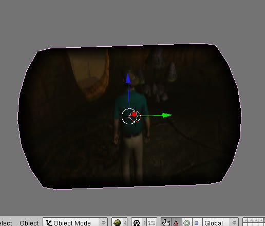
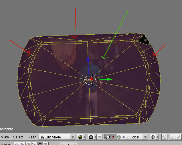
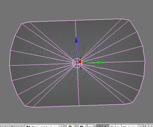
Here is mine with the texture all ready applied. This is the same shape as the ones used in the Hoods. Now you need to make the faces look like this:
This is how Cyan made theirs, and there is a reason for this, which will become clear when we go to UV Map the photo (it pays to understand how Cyan makes their meshes and UV Mapped their objects. You can achieve the same neat looking things by doing so).
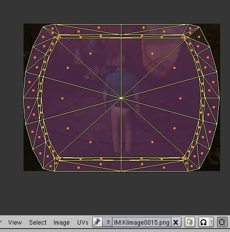
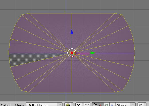
Go ahead and create a Material for this screen and pick the photo you want to use as your texture. Then Unwrap the faces to UV Map the texture. I suggest using "Project From View (Bounds). You should end up with a UV Mapped texture like this:
Now you know why we made the faces like Cyan made theirs: Those "blurred" edges we see when we look at the images on the Imager. Those squished, smaller faces around the edge, UV Mapped this way will produce the same effect.
Okay, a few more things to do here. We need to make the edges also fade out. We'll do this with a "Alpha" Vertex Painting.
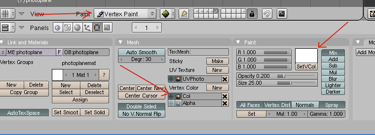
Make sure you have the Edit Panel up, and then go to Vertex Painting Mode:
In the Edit Panel, click on the "New" button twice for Vertex Color.
Make sure you press the 2 little windows next to the top one labled "Col"
Next, go to the "Paint" tab and click in the color box above the "SetVCol" button. Change the color to white like I have in my pic above, and then click on the "SetVCol" button.
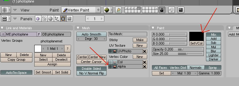
Now click on the 2 little windows next to the vertex color labled "Col.001" (that's what it will be called for you). Now click where it SAYS "Col.001" and change the name to "Alpha" like in my pic above.
Now go back to that color window above the "SetVCol" button, and change the color to black. DO NOT CLICK ON THE "SetVCol" BUTTON!!!!
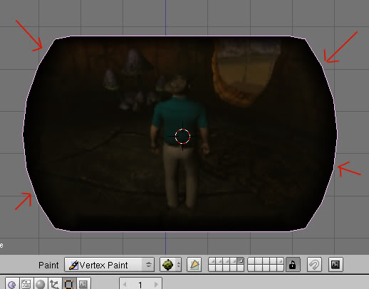
Instead, move your cursor to the 3D window, and paint all around our panel edges so they are black:
Once done with that, go back to Object Mode. And go to the Materials Panel.
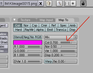
If you remember, we can always see though the images on the Imager to the "Guts" of the Imager. To do this, go to the Map To tab in the Materials Tab and adjust the "Col" slider to 0.700
NOTE: If the image seems too transparent or not enough when you link in to check things out, you can always come back here and adjust this.
Okay, that's it for the "Photo" screen. Let's move on to the "Static" Screen.
Static.....
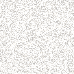
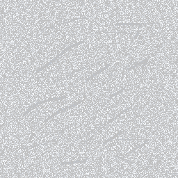
Okay, you're going to need 2 textures for this part. Making "static" images is very easy. All you need is a Photoshop type of paint program. However, if you don't feel like making any, you can use mine. You need 2, the positive and negative of the same image:
If you do make your own, remember to put the scratches in it like you see in mine, it's important, and if you look at Cyan's texture, you'll see they are there too.
Okay, now lets make that "Static" screen panel:
Again, it should be the same shape and size as the "Photo" screen, but the faces do not need to be as complex:
That's because there is no blurring on this screen.
Now go ahead and create the first Material and apply the "Positive" static texture to it. Then UV map it. You can use "Project From View" for this one.
Don't forget to turn "Shadbuf" off. I also added a little bit of grey in the color of the material.
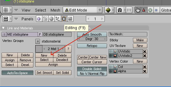
Now go to the Edit Panel. Create a 2nd material by clicking on the button I'm pointing to here:
Now go back to the Material Panel and go to the 2nd Material. You'll then need to go to the Texture Panel, make sure the texture is a "Single User" and then Delete it
If you look at my tutorial on Multiple Materials and UV Maps, Single Object, you'll know what I'm talking about here. In Blender, when you create a 2nd material for a mesh, it actually duplicates the first one. In the Texture Panel, you'll see where the first texture you used has been assigned to this Material. You make it single by clicking on the little "2" next to the texture name. If you just delete it with out doing this, you'll delete the texture for BOTH materials.
Okay, now you can load up that 2nd "Negative" static texture you either made or that I gave you above.
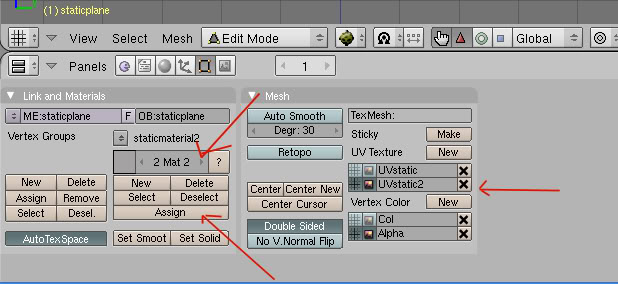
Now go back to the Edit Panel. Click on "New" for UV Layer, and click on the 2 little windows next to that new layer. Rename it something useful:
Next, make sure you are on the 2nd material, and then click on the "Assign" button my arrow points to.
Open up the UV Editor and apply the "Negative" static texture.
Now you'll want to fade those edges like we did for the "Photo" screen. Follow the same directions that I gave you on it for this screen, using the Vertex Painting.
Okay, now it's time to make that static "Dance"
Jitter Jitter Jitter
Make sure you're in Object Mode and go to the Materials Panel. We're going to "Animate" our 2 static textures.
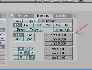
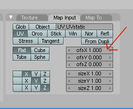
Make sure you are in Frame "1" and go to the MapInput Tab. Make sure that the xOfs, yOfs, and zOfs all say 0.000
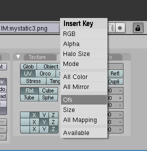
Now with your cursor sitting in this same tab, hit the "I" key and select "Ofs"
Now go to frame "5"
Again, go to your MapInput tab, and change either the xOfs or yOfs to 1.000
I used xOfs, but the choice is yours.
Okay, now, again, hit that "I" key with the cursor here and select "Ofs"
Now for the crazy, wacky part:
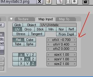
Go to frame 2, come back to the MapInput where the Ofs are, and set them to something wild in the xOfs and yOfs (keeping the values between -1.000 to 1.000
Then once again, hit that "I" key while here and select "Ofs"
Now repeat this for frames 3 and 4.
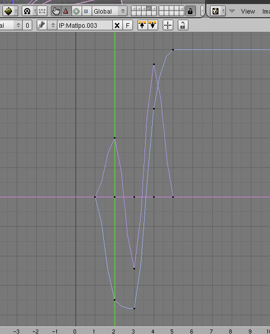
This will make the IPO curve for the texture animation crazy and all over the place:
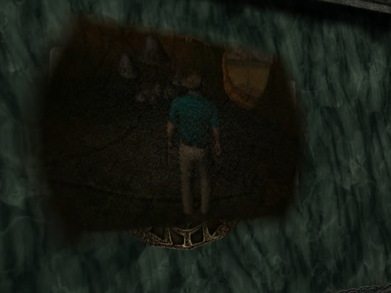
Because we're doing this in only 5 frames, the static will appear to be jittering all over the place when you link in and look.....which is exactly what we want.
NOW, go back and do the SAME THING for the 2nd material with the "Negative" static, only make sure you different crazy numbers for the Ofs.
That's it.....you're done!
Export and link in:
Keep in mind you can always go back and adjust the jitter if you're not happy with it.
I hope this tutorial was helpful.
Return To: Andy's Blender Tutorials
